A collection of logos I have designed, since 2015
Logo Folio
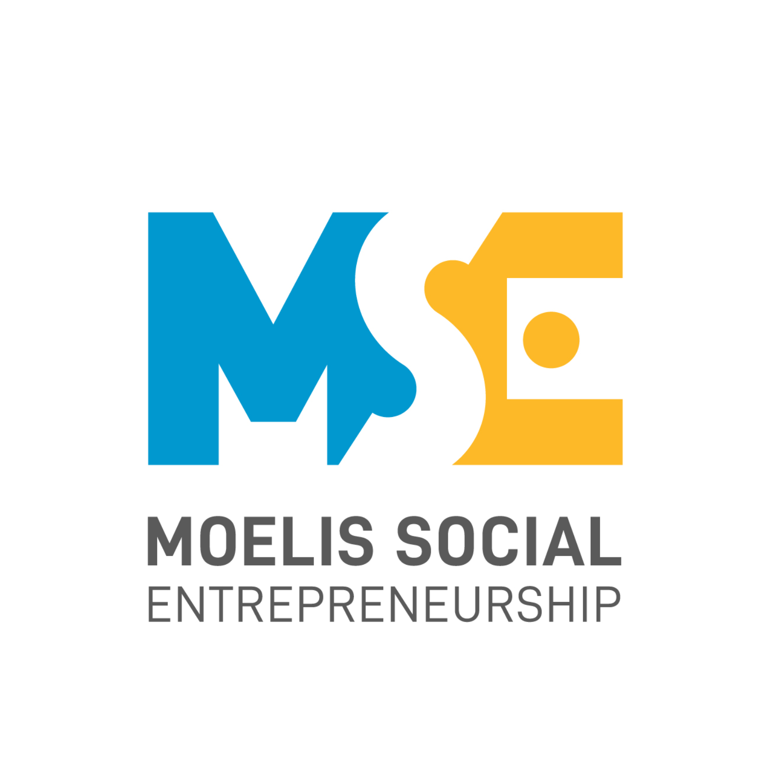
Moelis Social Entrepreneurship
John Jay College of Criminal Justice, New York
Visual identity for the Ron & Kerry Moelis Social Entrepreneurship Program, a new John Jay College initiative preparing students for careers in social innovation. The challenge was to create a mark that could stand in lockup with John Jay's established logo — drawing from its existing color palette — while giving the program its own fresh, forward-looking identity.
The lead concept, "Beyond 'ME'," plays on the idea of looking past the self toward the larger picture. Negative space suggests room for growth and free thinking, while geometric forms and an interactive type treatment invite the viewer to engage with the mark rather than simply read it — echoing the program's emphasis on design thinking and social innovation.

Intellecap
At Design Stack, Mumbai, I designed the logo for Intellecap, the advisory arm of the Aavishkaar Group that works to build businesses that can benefit underserved segments across Asia and Africa. The mark is built around the dandelion, using its dispersing seed head as a visual metaphor for growth, resilience, and development — qualities central to Intellecap's mission of nurturing ideas into lasting impact.
The design translates the dandelion's moment of release — seeds scattering outward from a single point — into a radiating, upward form that reflects organic growth and adaptability. Simple and memorable at any scale, the logo carries this deeper meaning consistently, positioning Intellecap as a catalyst for inclusive, ground-up development.
Utthan
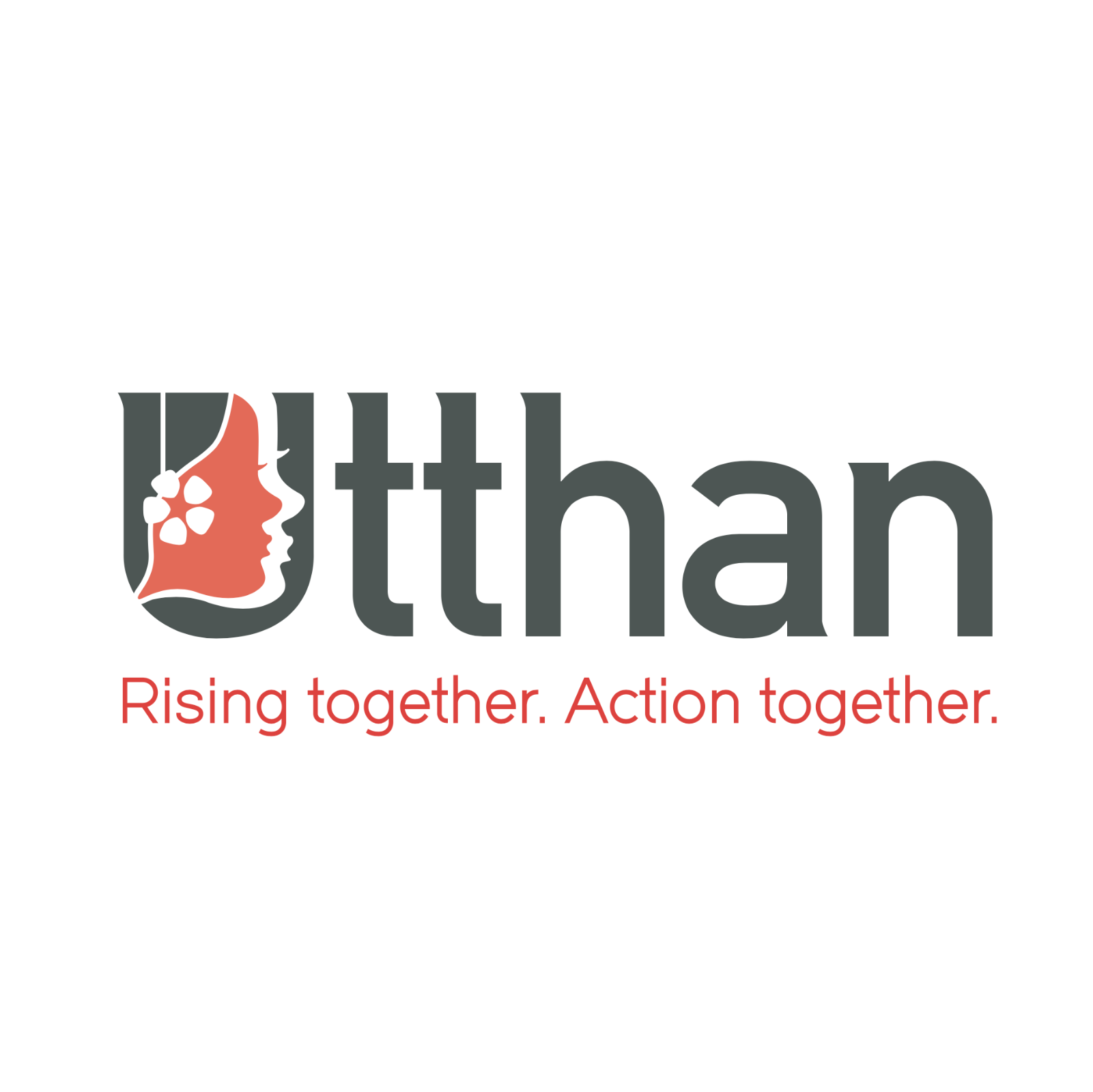
Utthan (উত্থান) is Bengali for rise up or upliftment. A fitting name for a 15-woman survivor-led collective under Sanjog India that trains human trafficking survivors in leadership, restorative care, and advocacy. I had the privilege of working with them as a design consultant for two years.
The identity centers on a logotype in which the letterform itself becomes the illustration. The "U" is built from two layered female profiles — one woman's face nested against another's — visualizing the sisterhood and mutual support at the heart of the program: women watching out for each other while building the confidence to stand on their own. A bold, striking typeface carries this mark, paired with a palette of coral (feminine strength and power) and grey (support and foundation).
Alyson - The Store
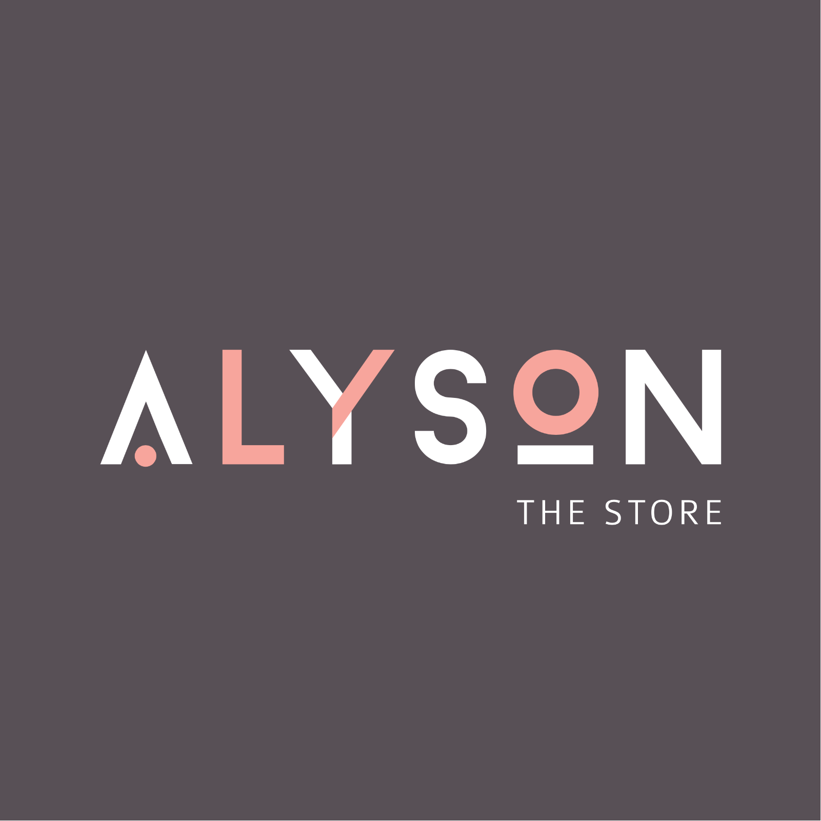
Alyson is an Indian fashion retail store in one of Ahmedabad's most fashionable neighborhoods, offering women a curated edit of international apparel and accessories. The brief called for an identity that felt youthful, contemporary, and inviting — confident enough to sit alongside international labels, yet warm and approachable.
The result is a clean, geometric logotype in confident sans-serif letterforms, accented with a soft blush pink. Stripped of anything decorative, the wordmark reads as modern and assured, translating equally well onto a metal shopfront sign, a shopping bag, or a social media grid. Alongside it, a distinct brand symbol representing "The Alyson Woman" was crafted as a recurring visual motif to reinforce brand recall beyond the logotype alone.
Filmy Mutt Studio
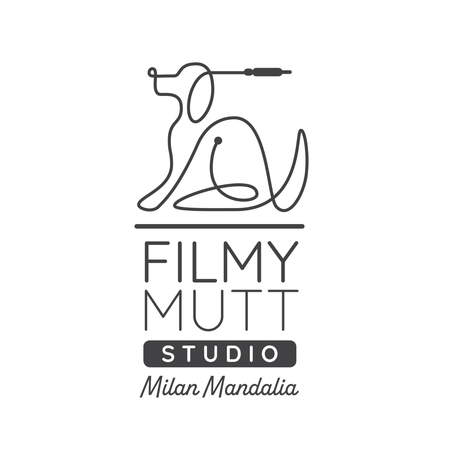
Logo design for Filmy Mutt, the recording studio of composer and music producer Milan Mandalia. The studio specializes in recording, mixing and mastering film songs in Hindi and Gujarati, and its name plays on "filmy" (also spelled filmi), the Indian English term for anything melodramatic and larger-than-life in the style of a Bollywood film.
The mark is built from a single continuous line that does double duty: it traces the silhouette of a scruffy, seated dog/mutt, while simultaneously forming an audio cable, complete with a plug at one end. The wordmark below closes with Milan Mandalia's name set in a loose script signature to focus on the personal care that every studio session promises.
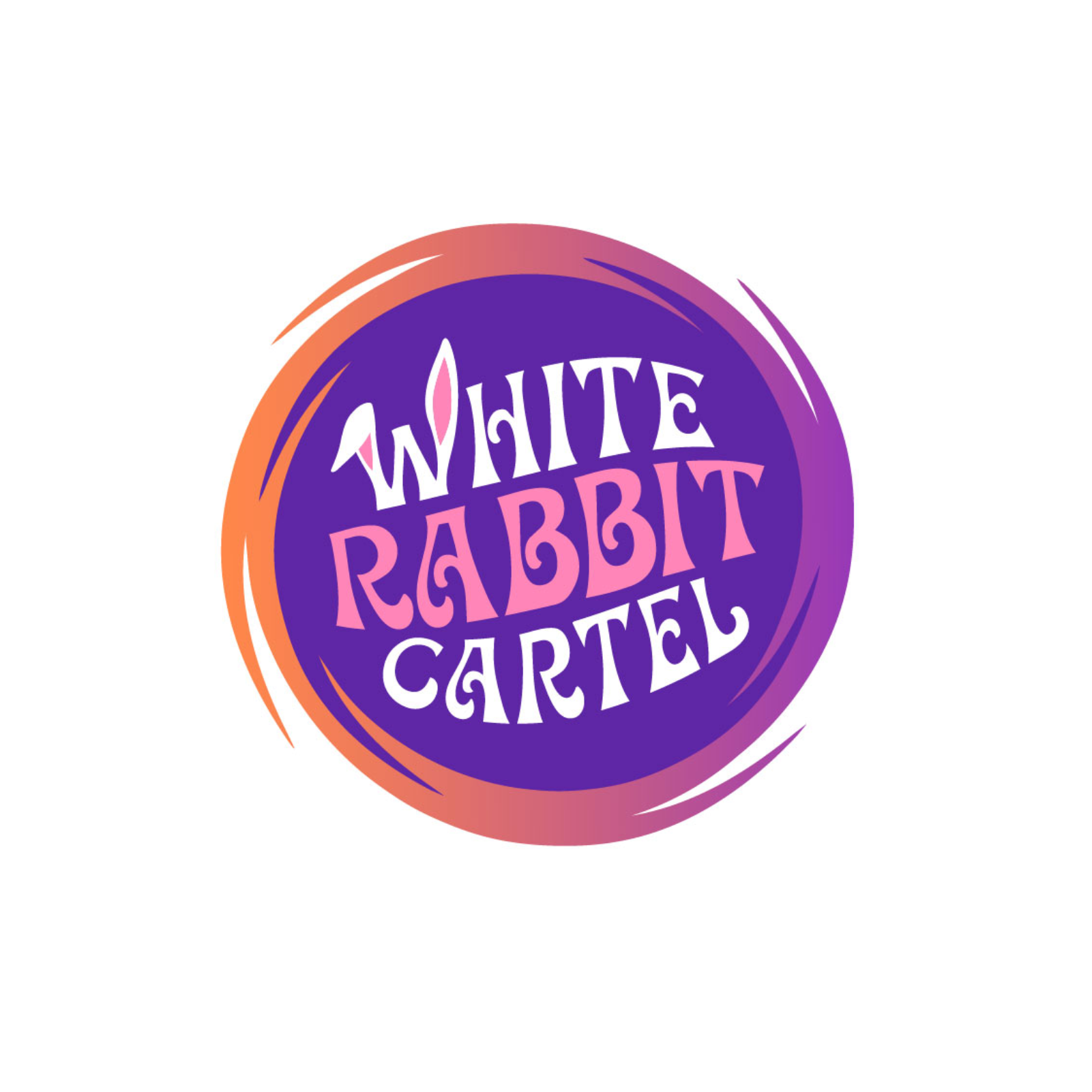
White Rabbit Cartel
White Rabbit Cartel is a creative collective making films, live experiences, and original IP, with curiosity, 60s acid culture, and eco-activism running through everything they touch. The identity needed to reflect this personality in a playful and credible way.
The logo centers on a hand-lettered trippy wordmark contained within a rotating rabbit-hole, where each letterform tilts and swells, echoing the psychedelic reference points baked into the brand's DNA. A pair of rabbit ears doubles as the "W," without leaning into a literal rabbit illustration. The palette pairs violet with a sunrise gradient of orange, coral, and magenta framing the badge. The result is a mark that feels handcrafted rather than corporate, versatile enough to sit on a film slate, a festival stage backdrop, or social profile alike.